Tag Archive for Book Covers

More on Book Covers: New Paperback Cover for SIX INNINGS

In 2008, Feiwel & Friends published my first hardcover novel, Six Innings, a book that was eventually named An ALA Notable. The cover was fabulous, featuring the work of gifted illustrator Chris Sheban, whose style you might recognize from the covers of Because of Winn-Dixie, Brooklyn Bridge, Punished, The Tiger Rising, and more.

Six Innings sold reasonably okay, earned some kind reviews (and a Judy Blume comparison!), and nobody got rich; we were happy. When it was time for the book to go to paper, my publisher had to make a decision. Come up with a new cover, or simply reproduce the existing cover in a paperback format, which is what they did.

And the paperback edition did not sell. Understatement. It struck out, looking.

This could be for a variety reasons, but one line of thought was that we were dealing with two different markets. The hardcover, with awards and good reviews, sold well in the institutional market. Paperback was a different animal, targeted more directly to the reader. I want to say the less sophisticated consumer, but that’s not right. Children these days are plenty sophisticated, it’s just that their tastes are their own. To them, these days, the photographic approach seems to hold more immediacy.  At least that’s the current thinking.

So check out the new look (the original is up top in the header):

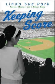
While I’ve got you (as my dad used to say), Linda Sue Park’s Keeping Score was another baseball-themed book that came out at the same time. And I confess: I hated the cover. That poor book, I thought. It just struck me, a former 10-year-old boy, as all kinds of wrong.

Someone must have agreed. Take a gander at the paperback.

Quite a difference, huh? It doesn’t look remotely like the same book. Curiously, in this case, the publisher went from a photographic to an illustrative approach, but more significantly re-thought the cover content and updated the design. A successful change, I think, though a dog and a fire hydrant makes me think of only one thing. Was that the idea? Dog pee? Maybe dog pee figures into the book somehow (I have not read it). The ex-boy in me wouldn’t have picked up that cover, either.

It’s also possible that the book was rewritten, with the girl character replaced by a black lab.

In the end, covers are a tricky business. The author’s job is what’s inside.

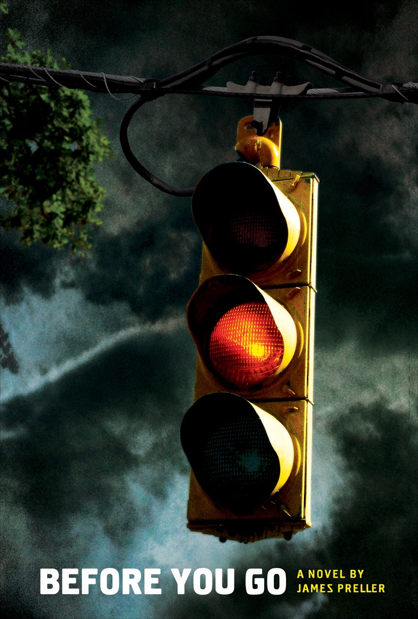
The First Look of the Rough-Draft Book Cover, “BEFORE YOU GO”

And so it comes after all that waiting, the book cover. Via jpg these days, that’s how you get the first glimpse of it, clicking on a file attached to an email.

And it comes with caveats, apologies, explanations, assurances. The idea is not to get too literal (and they say this to writers, the most literal of all).

You wrote the book what seems a lifetime ago. Revised it, revised it again, and again, to the point where you’ve moved past it. You’ve gone from loving it to sick of it to almost forgetting what it’s about anyway. Curious, you might even read it again one day.

In the meantime, an art director, Rich Deas, reads the manuscript, searching for ideas, hoping images will come unbidden. It’s an opening-up process, where all possibilities are invited, explored, played with, ridiculed, winnowed down. Meetings are  taken, editors opine, directions are discussed and discarded. The sales folks has their say and everybody listens because, lest you forget, we’re all in the business of selling books. As the author, you’re out of the loop. A million miles away. It’s time for other people to do their jobs, time for their talents to shine.

You cross your fingers and hope.

All preamble: Today I received an electronic file for the cover of my first Young Adult novel, Before You Go, to be published in Spring, 2012. What you see here, please understand, is a rough version. My editor, (the fabulous) Liz Szabla, told me, more or less, ‘It’s too this, it’s too that, and possibly not enough of something else. The type isn’t final — we’re still thinking about the type — none of it is final — but don’t you love it? We all love it. Rich is still tweaking it. He wants to make changes, I’m not sure what. He’s tweaking right now. I can practically hear the tweaking going on across the hall. You know Rich. He sees it all in his head. Tell me what you think. Don’t you love it?”

Here it is, folks. The first glance at the art director’s first draft, the rough cover treatment for my new book.

Some days it really is fun to be an author. Yes, Liz, I do love it.

I wonder what the final will look like.

Worst Book Cover Ever?

Looking for links to supplement tomorrow’s blog entry, I did a quick search of “bad book covers” and happened across Cooking With Pooh.

Um, gee, no thanks. I’m not really hungry.

Inside Scoop: Book Covers, Along Came Spider

On Sunday night I began to write a post about my new “Jigsaw Jones” cover, but didn’t have all the info I needed to make it happen. So, instead, let’s just dub this COVER WEEK and begin here:

A while back, in May, I tried to discuss some cover changes that Scholastic went through for my book, Along Came Spider. Unfortunately, at the time I was less than adept at some technical aspects of blogging. So it failed miserably. But today I can show you the two covers, rejected and final, in one place. Please click the link above if you wish to read more background discussion.

Note that the “rejected cover” was the real cover until very late in the process. It was used in promotions, put into catalogs, everybody had signed off. Then, at the last minute, and practically overnight, it was completely redone with an entirely new direction.

The original (rejected) cover:

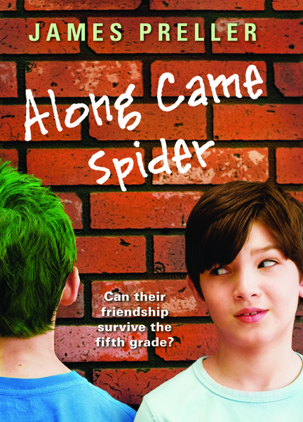
The final version:

Book Covers

Above, you should (maybe, possibly, hopefully) see the cover to my new hardcover book, Along Came Spider, due for publication this September (Scholastic, ages 8-12). Except, well, that used to be the cover until about three weeks ago. You see, I got a phone call from my editor at Scholastic, the newly-engaged Shannon Penney, who explained that, essentially, some folks on the sales staff at Scholastic hated the cover. After some internal debate in the NY office, they decided to create “a new look.”

I was then sent the new cover:

Quite a difference, no?

I was recently at a regional conference for librarians (CASDA), participating in a panel discussion. The subject of covers came up and there seemed to be quite a lot of interest. Some in the audience seemed genuinely surprised at how little control we, the authors, had. Of course, control varies according to the status of the author, the style of the publisher, the deadline, and the book. But for the most part, writers don’t have final word. Or much say at all. And I think that’s fair, since the publisher is the one who is out there trying to sell the book. Sure, we can make a fuss about things, but there’s a risk to that — nobody likes a “difficult” author.

Hey, let’s face it, book-making is a collaborative process. I think you have to let people do their jobs. And when the sales force says, “We can’t sell a book with that cover,” well, I’m not going to throw my body into the gears of that machine. Because I want the book to sell, too (sue me), and I’m not the expert.

Now, is this new cover an improvement? I don’t know, but it certainly communicates different things than the original. To begin, I thought the first cover was brilliant graphically: a bold, arresting visual presentation that suggested the school environment. It looked cool, almost like a poster. But at the same time, sort of vague; you don’t come away knowing much about the story. Yet the vagueness was appealing; it was evocative. Or so I thought at the time. Besides, after you read the book — if you read the book — you’ll then “get” the cover. It will all make sense.

The second cover — now forever known as the real cover — established a totally different look by using photography. That’s always a difficult medium, especially for writers, because the nature of photography provides a specific, concrete image. It defines. It limits. We now know exactly what Spider Stevens looks like, whereas before it was open to our personal interpretation, up to our imaginations. What this cover does do, however, is it quickly lets us in on the story. A glance tells us that it’s about two boys. One has green hair and seems to be staring at a brick wall; he might be an odd duck. Then there’s the tagline: “Can their friendship survive the fifth grade?” All in all, the new cover effectively conveys the central strand of the book. But it also limits because the book certainly isn’t about only that. There’s Miss Lobel, the librarian. And the fabulous Ava Bright. And basketball. And . . . pencils!

I don’t really have the answers. There are no firm rules about what makes a good cover. Or what, precisely, a cover should do (other than, I guess, encourage you to open the book). What do you think? So far, no one has used the “comments” section to this blog. Here’s your big chance!