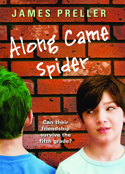
Above, you should (maybe, possibly, hopefully) see the cover to my new hardcover book, Along Came Spider, due for publication this September (Scholastic, ages 8-12). Except, well, that used to be the cover until about three weeks ago. You see, I got a phone call from my editor at Scholastic, the newly-engaged Shannon Penney, who explained that, essentially, some folks on the sales staff at Scholastic hated the cover. After some internal debate in the NY office, they decided to create “a new look.”
I was then sent the new cover:
Quite a difference, no?
I was recently at a regional conference for librarians (CASDA), participating in a panel discussion. The subject of covers came up and there seemed to be quite a lot of interest. Some in the audience seemed genuinely surprised at how little control we, the authors, had. Of course, control varies according to the status of the author, the style of the publisher, the deadline, and the book. But for the most part, writers don’t have final word. Or much say at all. And I think that’s fair, since the publisher is the one who is out there trying to sell the book. Sure, we can make a fuss about things, but there’s a risk to that — nobody likes a “difficult” author.
Hey, let’s face it, book-making is a collaborative process. I think you have to let people do their jobs. And when the sales force says, “We can’t sell a book with that cover,” well, I’m not going to throw my body into the gears of that machine. Because I want the book to sell, too (sue me), and I’m not the expert.
Now, is this new cover an improvement? I don’t know, but it certainly communicates different things than the original. To begin, I thought the first cover was brilliant graphically: a bold, arresting visual presentation that suggested the school environment. It looked cool, almost like a poster. But at the same time, sort of vague; you don’t come away knowing much about the story. Yet the vagueness was appealing; it was evocative. Or so I thought at the time. Besides, after you read the book — if you read the book — you’ll then “get” the cover. It will all make sense.
The second cover — now forever known as the real cover — established a totally different look by using photography. That’s always a difficult medium, especially for writers, because the nature of photography provides a specific, concrete image. It defines. It limits. We now know exactly what Spider Stevens looks like, whereas before it was open to our personal interpretation, up to our imaginations. What this cover does do, however, is it quickly lets us in on the story. A glance tells us that it’s about two boys. One has green hair and seems to be staring at a brick wall; he might be an odd duck. Then there’s the tagline: “Can their friendship survive the fifth grade?” All in all, the new cover effectively conveys the central strand of the book. But it also limits because the book certainly isn’t about only that. There’s Miss Lobel, the librarian. And the fabulous Ava Bright. And basketball. And . . . pencils!
I don’t really have the answers. There are no firm rules about what makes a good cover. Or what, precisely, a cover should do (other than, I guess, encourage you to open the book). What do you think? So far, no one has used the “comments” section to this blog. Here’s your big chance!


Leave a Reply