In 2008, Feiwel & Friends published my first hardcover novel, Six Innings, a book that was eventually named An ALA Notable. The cover was fabulous, featuring the work of gifted illustrator Chris Sheban, whose style you might recognize from the covers of Because of Winn-Dixie, Brooklyn Bridge, Punished, The Tiger Rising, and more.
Six Innings sold reasonably okay, earned some kind reviews (and a Judy Blume comparison!), and nobody got rich; we were happy. When it was time for the book to go to paper, my publisher had to make a decision. Come up with a new cover, or simply reproduce the existing cover in a paperback format, which is what they did.
And the paperback edition did not sell. Understatement. It struck out, looking.
This could be for a variety reasons, but one line of thought was that we were dealing with two different markets. The hardcover, with awards and good reviews, sold well in the institutional market. Paperback was a different animal, targeted more directly to the reader. I want to say the less sophisticated consumer, but that’s not right. Children these days are plenty sophisticated, it’s just that their tastes are their own. To them, these days, the photographic approach seems to hold more immediacy. At least that’s the current thinking.
So check out the new look (the original is up top in the header):
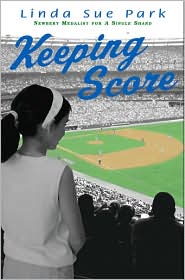
While I’ve got you (as my dad used to say), Linda Sue Park’s Keeping Score was another baseball-themed book that came out at the same time. And I confess: I hated the cover. That poor book, I thought. It just struck me, a former 10-year-old boy, as all kinds of wrong.
Someone must have agreed. Take a gander at the paperback.
Quite a difference, huh? It doesn’t look remotely like the same book. Curiously, in this case, the publisher went from a photographic to an illustrative approach, but more significantly re-thought the cover content and updated the design. A successful change, I think, though a dog and a fire hydrant makes me think of only one thing. Was that the idea? Dog pee? Maybe dog pee figures into the book somehow (I have not read it). The ex-boy in me wouldn’t have picked up that cover, either.
It’s also possible that the book was rewritten, with the girl character replaced by a black lab.
In the end, covers are a tricky business. The author’s job is what’s inside.


Interesting. I can see that the new paperback cover for Six Innings would appeal more to my own 10-year old boy. Of course, he pitches, so the focus of the pitcher is part of it, but also, I think it just looks more modern, which I think would appeal to him more. Maybe I’ll check both versions out from the library and see what he says. A one person test case. 🙂
Juliana, the new paperback cover won’t be out for a while — until they sell off all the old paperback versions in the warehouse.
Might be a looong while.
James,
Do you make yourself crack up when you write?
Your blogging fan,
Julie
Julie, us bloggers have to stick together! Do I make myself crack up? I don’t know, but when you blog for an uncertain readership — anybody out there? anyone? Bueller? — then you’ve got to at least please yourself.
BTW, I continue to admire the simplicity and beauty of your Picture Book Illustration blog. Nicely done. Readers, check it out . . .
http://picturebookillustration.blogspot.com/
Well, you made me laugh. Thanks!
It’s nice that your publishers believe in your book enough to put out a new paperback edition.
I like the glove action on the new cover.
The hardcover edition was an easy handsell for me, but that’s because I loved the book.
The cover didn’t help convince customers to buy it. Though at the same time it didn’t hurt.
While the cover didn’t draw readers in, they at least kept listening.
One thing I hated was being burned on a handsell because of a cover.
At one point I stopped reading books with poor covers that would turn customers away. It seemed like a waste of time.
Booksellers try to sell the books, so publishers should do their best to produce good covers, or at least covers that don’t have customers shaking their head no on first glance.
For a bookseller that’s an awful head shake, before you even start the pitch your already in the hole.
I loved Keeping Score but didn’t even give the hardcover a second glance. Because it doesn’t scream serious baseball goodness inside. But one day I decided to check it out from the library, and was pleasantly surprised.
I was very happy to see they went with a differnt paperback cover for Keeping Score. I liked the new cover and I tired my hardest but couldn’t get any readers to bite.
And something is very wrong if I can’t get customers to bite on a baseball book. Be it a direct handsell or table display, Keeping Score wasn’t selling.
James sorry this is so long and I know you’d love Keeping Score.