Tag Archive for 5 Questions Preller

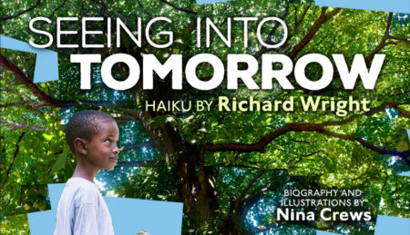
5 QUESTIONS with Nina Crews, illustrator of “Seeing Into Tomorrow”

SITannounce.C-450x259


The first time I met Nina Crews, I was eating on the hallway floor of a school in Albany, NY. Just sitting there on the tiles, catching a few minutes for lunch during a book festival. Nina sat down across from me and, putting two and two together, I asked, “Are you the daughter of Donald Crews?” We had a nice chat that afternoon; a number of years passed; and now with the publication of her quietly remarkable book, Seeing Into Tomorrow, I reached out to Nina again. She’s an easy person to like, an artist with a deep commitment to children’s literature. I don’t have a powerful spotlight here at James Preller Dot Com, but this is an artist who merits our attention.

Here comes Nina now . . .


Crews_041915_0171sm

Congratulations on your new book, Seeing Into Tomorrow. I’ve been waiting for this one since we first discussed it via Facebook about a year ago.

Thanks so much! I am so happy to have it out in the world!

Lately I’ve been on a major haiku kick of my own, reading and writing a little bit each morning. I’ve been reading through a collection of more than 800 of Richard Wright’s haikus. I enjoy taking them slow, savoring each poem, just a few pages before I start the day. I originally took Wright’s book out of the library, but soon realized that I needed to have my own copy, write in it, keep it on my shelf. How did you select the poems included here? That seems like an impossible process.

shoppingI know the Wright book very well! It was the source for the haiku included in my book. I read through it numerous times and also used a lot of post-its. Each review brought new discoveries, and also helped me clarify the direction of the project. There were really two main criteria that a poem had to meet for me to add it to my shortlist. First, I looked for poems that could resonate with children emotionally and second, for poems that could be portrayed through relatable everyday scenes.

I’m moved by the idea of Richard Wright turning to haiku late in his life, at a time when he was struggling through a long illness, sliding toward death. I sense that the process of writing these poems –- and seeing the world through them — comforted him. There’s terrible beauty in these poems.

Yes. I know what you mean. It was also a period of mourning for him. His daughter writes in the introduction to the haiku book that two close friends passed away in 1958. Even more significantly, his mother died in 1959. I imagine these losses put him in a very reflective mindset. His daughter calls his writing of haiku “self-nurturing.”

That’s a nice phrase, much better than “self-medicating.” With haiku, like yoga in a way, I believe the experience of writing them, of being present in the world, is more personally meaningful than the end product. Anyway, Nina, tell me about your cut-up approach to the photographs. I’m not a visual artist, but I used to fool around with that technique years ago, inspired by the work of David Hockney. It’s a lot of fun.

09_yellow_kite

I am a fan of David Hockney’s photocollages and studied them closely while I was working on this book. For the most part, my images were not created by cutting up a single image, but by closely cropping the scenes as I photographed. I’d start at one end of a scene and move my camera, over bit by bit, up and down, to the left or to the right to cover the entire area. I liked the movement that this technique created and wanted the additional variation that would come from shifts in perspective or focus as I moved around. If you look closely at Hockney’s images, you’ll see that he does this, too. I think it gives the final image a bit more “breath.”

Oh, I get it now. I assumed it involved scissors, a lot of cutting and snipping and pasting. Why did you feel that approach was right for this book?

I read a great essay about haiku that talked about how the poems should have a sense of movement in them. There are a number of ways one can show movement in photography –- motion blurs or sequential images for instance. This approach is another way of showing movement and I liked how shapes of the collage could create a gesture on the page with the child portrayed acting as an anchor.

I appreciated how the book begins with a haiku about a name written in the snow, which to me is a declaration of existence, “I am” . . . and how a signature returns later in the book . . . and you close with a hopeful vision of, or for, tomorrow. Nicely curated, Nina.

Thanks!

You focused your camera exclusively on African American boys for this book. Why boys?

06_dirt_road

There were a few things that factored into this decision. Early on in my work on the book, I read Black Boy, Wright’s autobiography. In it, he describes how he experienced nature as a young child and the language he uses in those passages is similar to the language in his haiku. My exploration of shopping-1these poems became an exploration of Wright’s biography and photographing African-American boys made sense to me. It also struck me that there are not a lot of “nature” books with children of color, in general, and African American boys, in particular. I am pleased to give this “picture space” to young brown boys.

Am I right in recognizing Prospect Park, in Brooklyn, in some of these images.

Yes. I did photograph some scenes in Prospect Park. It is really an extension of my studio. Because the images for this book really depended on the right light and the right weather, I took advantage of every opportunity I had to get shots I might use. I also photographed extensively in upstate New York – Bear Mountain and the Hudson Valley.

You dedicated this book to your family. You certainly have talented parents, in Ann Jonas and Donald Crews. No pressure, Nina, just be amazing!

51Lz8Nj7V+LYes, they set a high bar. They also provided a lot of support and have been great role models. But beyond my parent’s role in my development as an author illustrator, I feel a great deal of gratitude to my family for many less tangible lessons. For instance, I am thanking my grandparents who told me about their childhoods on farms in the South and my parents for taking my sister and I on many walks in nature.

That’s your father, isn’t it, admiring the freight train. I see what you did there, since his book, Freight Train, was a Caldecott Honor Book. He always brought a great sense of design to his work.

Yes, I asked my father to do a cameo for this page. It’s a nod to his work -– Freight Train and Short Cut and also inspired by the fact that he enjoys watching trains with his grandchildren. That’s my son with him.

10_railroad

I actually interviewed your father many years ago, in the early 90s, for a book I did with Deborah Kovacs, the out-of-print classic, Meet the Authors and Illustrators. He struck me as a calm, gentle, elegant, highly-cerebral kind of guy. I picture him in a bowtie.

He owns many bowties, though does wear standard neckties as well. He’s very stylish and one of my favorite people!

Well, Nina, I’m really glad we were able to share this time together. You have a lot to be proud of with this beautiful book. Well done!

Thank you! I have enjoyed our chat!

——-

To learn more about Nina Crews, visit her website. Nina’s book includes substantial biographical information on Richard Wright, adding depth and layers to a reader’s experience of the poems. 

To explore more interviews in the award-winning (not really) 5 QUESTIONS series, click here and scroll, baby, scroll. You’ll find interviews with London Ladd, Matthew Cordell, Bruce Coville, Lizzy Rockwell, Aaron Becker, Elizabeth Zunon, Robin Pulver, Jeff Mack, and many more.

 

5 QUESTIONS with JEFF MACK, author/illustrator of “Look!”

jeffmackheadshot


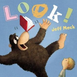
Jeff Mack, nicest guy in the room! Thanks for stopping by. I’m so glad you’re here to discuss Look!, a picture book that uses only two words, “look” and “out.” Before we begin though, I have three words for you: “Wipe your feet.” Sorry, new carpeting. 

Oops. Sorry about the mess, Jimmy. That rug really tied the room together.

Nothing says classy quite like orange shag carpeting. I just did up my van with the remnants.

Nice.

As a writer — as a professional counter of words — I’m envious. I keep having this image of you dressed in a red satin robe, sitting down at an old-fashioned typewriter, cracking your knuckles, and typing with one finger the word “Look.” At which point you sit back, hand on your chin, and muse thoughtfully. Your manuscript is half done. Is that about right?

Yes, that’s right.

For Look!, try to take us back to the beginning. How did this book start for you?

22521929-_ss318_

In 2006, I sketched out a story about a fruit-juggling bear who accidentally scares a bunch of cub scouts. Believe it or not, that turned into a sweet bedtime book called Hush Little Polar Bear. No fruit-juggling. No cub scouts.

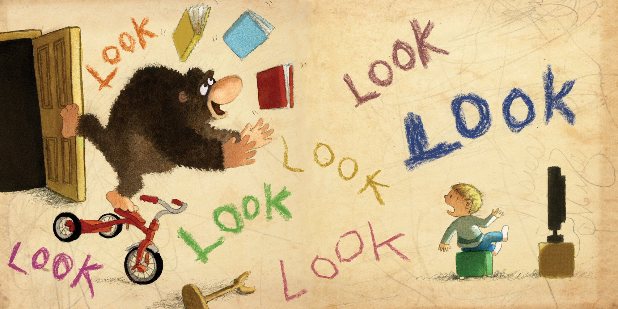
Years later, I was cleaning my studio, and I found my original sketches of the fruit-juggler. A new idea popped into my head: what if the bear juggles books instead?

lookjugglingbear

That was in 2013. Who Wants A Hug? was about to be published, and it also has a bear in it. I wanted the books to stand apart, so I made the book-juggler a gorilla. And now he only juggles on one page.

In the end, pretty much everything changed from my original idea. You wouldn’t even recognize it. Now that I think about it, I should probably write a book about a fruit-juggling bear.

lookapejugglesfinal

Frank O’Hara has a great poem about that same dynamic, titled “Why I Am Not a Painter.” Readers should click that link to check it out.

Sorry, I digress . . .

Jeff, I think you create the deceptively simple picture book about as well as anyone working in children’s books today. The challenge, I suppose, is creating an age-appropriate story that isn’t simple at all –- that’s distilled to its essence — that has depth. Or at least humor. Is that something that comes naturally to you? Because for many of us, it’s why writing picture books is so hair-pullingly impossible. There’s so little room for error.

Certain parts of the process might come naturally. I always start out by scribbling a series of stick figures. That feels pretty natural. I don’t think deeply or critically while I’m scribbling. I just go with my gut and see what comes out.

It starts to feel exciting if I notice a deeper meaning taking shape. Then I’ll play around with the words, making sure they add something interesting to the mix. I don’t want them to just repeat what you already see in the pictures.

After that, there’s a long, difficult process of editing and revising. This is the hair-pulling, hand-wringing, axe-murdering part of writing. I’ll sketch parts of the book over and over again until the sequence feels exactly right to me. I might do a thousand sketches for a 32-page book. Remember Jack Nicholson in The Shining? I can relate.

look5

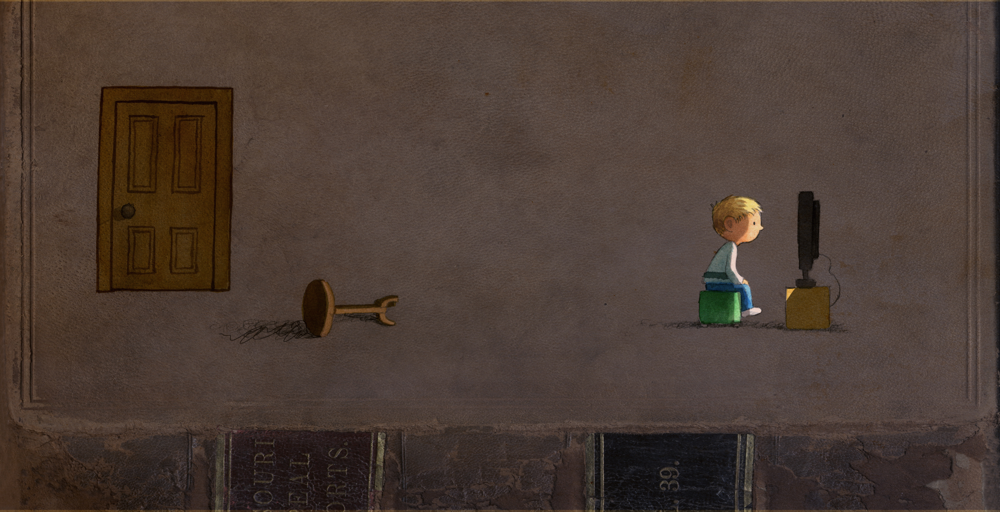
The most poignant illustration in the book, for me, comes midway through the book after the boy kicks the gorilla out of the room. The palette darkens. And he sits close to the television, lured by its glow. That spread is horribly sad, or sadly horrible, in a book that is ultimately filled with light and good cheer.

Tell us about that one picture.

lookdarktvpage

In a different story, maybe this picture would look comforting. It’s dark. It’s quiet. Maybe he’s binging on The Good Wife or something.

But, no. Not here. The boy just kicked the gorilla out of the room. He rejected a friend. So his solitude seems kind of pathetic.

This is what I love about telling stories with pictures. I can guide readers how to feel about a certain image by putting certain others before it. If I get the sequence right, I barely need words.

Studies, sketches.

Studies, sketches.


There’s also deciding what to get rid of. Sometimes I have to cut a favorite image or sequence because it distracts from the focus of the book. That can be heart-wrenching too. I have to keep an open mind. There’s always a ton of stuff left behind on the “cutting room floor.”

I’ve been dabbling as a writing coach with high school students on their college essays. I’ve had that conversation several times already, the idea that during revision we sometimes have to “kill our darlings” — deleting those passages we’ve come to love that, alas, don’t serve the greater cause. Cut, slice, destroy. It’s a painful process.

It’s why I start with stick figures.

looksketches

You enrich this story with a subtle, understated device. From a design perspective, it’s a book inside a book. Or at least, you drew inspiration and texture from the visuals of a battered, old library book. Why did it make sense for this story?

A couple of years ago, I made a book called The Things I Can Do. I just used random stuff from around the house: construction paper, bandaids, bubble gum, a piece of wood, ketchup. It was fun. It was messy. It looks like a four-year-old made it. Every page came out differently depending on what I used that day.

thingsicando

When it was time to make LOOK!, I started doing the same thing. Except complete chaos didn’t really suit this story. Sure, it has some intense parts, but it also has plenty of calm moments. I needed a style that would give me a range of moods to work with. Since the main character is a gorilla who learns how to read and share books with a boy, I limited my collage materials to a variety of book covers and torn pages. That way, I was able to make a dynamic book where all of the visual elements connect directly to the plot.

You really work the whole page, Jeff. Nothing is accidental or tossed off. There’s great care, for example, even in the typeface.

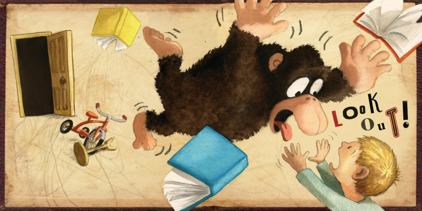
Oh right, the typeface. I don’t use “he said” or “she said” in LOOK!. Instead, I attribute the characters’ voices by making typefaces that tell us something about their personalities. When the gorilla speaks, it looks like a little kid scribbled in the book with a crayon. When the boy speaks, it looks like an adult carefully pasted in letters from magazines.

I put a lot of care into choosing and arranging each element. But chance also played a huge part in the process.

After I collected the books and pages that I wanted to use as backgrounds, I matched them up with the characters one by one. I did this randomly, without any planning.

look1

look2

look3

look4

If the images didn’t merge in an interesting or convincing way, I moved on to the next combo. When the images did work together, it was often because of some surprising good luck, like the way a tear in the page intersected with a crashing object, the way random pencil scribbles added manic energy to a scene, or the way a border around a character suggested a pause in the action.

A big challenge when I’m working on these little details is finding the right balance. I want readers to notice them, but they have to stay subtle. Otherwise, they could distract from the plot.

At the Rochester Children’s Book Festival, you and I had the opportunity to talk a little bit about the importance of endings. When it comes to a picture book, you absolutely must nail the ending –- or else it’s not a successful book. I once interviewed James Marshall and he was adamant about that. He said, “A fizzled ending is a fizzled book.” Do you struggle with endings?

I think every part of the book has to be successful. It might be easier to hide a flaw somewhere in the middle. But it’s pretty much impossible to ignore a flawed ending. It’s like getting a zit on your nose instead of someplace else.

But nailing the ending means something different for each book.

For instance, some books call for a loud, obvious punchline at the end. I’m thinking about that book with Grover, The Monster at the End of this Book, where all of his troubles build up to a surprise twist on the last page.

Others work better when the ending slowly creeps up on you and then makes you think. You can see it coming, but when it does, you can’t believe it’s over. The Giving Tree is like that. And some, like Goodnight Moon, have endings that just drift beautifully away.

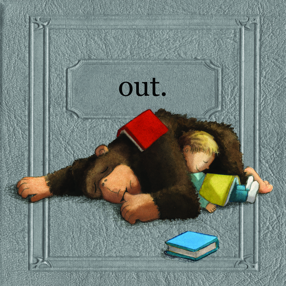
I wrote a few endings for LOOK! before I finally decided on the one that’s in the book. An earlier draft ended with the word “out” written above a smashed tv in a garbage can. It was a strong point, but it wasn’t the one I really wanted to make.


Rejected ending.

Rejected ending.

On the surface, LOOK! is about a battle of books vs. tv. But on a deeper, more important level, it’s about paying attention to each other and not tuning out the world around us. Throughout the story, the boy and the gorilla struggle to connect. I wanted to see them finally get there. So I ditched the garbage can and showed them falling asleep together. That felt like the most satisfying moment to end with because it directly and completely solved their problem. At least until the sequel.

lookfinalend

You seem to have a natural sense of young readers, what makes them laugh, and generally how they interact with a book. It’s a cliché to say that you tap into your own “inner child.” But I wonder, Can you think of any other explanation?

Honestly, I just write about the stuff I like. I have been writing and illustrating stories ever since I was a little kid. My activities haven’t changed. I’m still in touch with my childhood feelings and interests, except now I’m motivated by adult feelings and interests.

Look at it this way: in the early 1980’s I watched a lot of sci-fi on tv, especially drwhoDoctor Who. As a ten-year-old, I loved the monsters because they were scary and cool. Now that I’m a forty-four, what I love about those old monsters is how cheap they look. I love that a slimy monster arm is really just bubble-wrap with green spray-paint on it. It fills me with happiness. It’s the same feeling of happiness I felt when I was ten, but now I feel it for a different, more complicated reason.

Having that feeling helps me remember what I enjoyed as a kid. And those memories inform all of my books whether they are 32-page picture books like LOOK! or 250-page chapter books like Clueless McGee.

The best books seem to work on both levels, for children and adults.

Yes, I think so. That was my goal for Clueless McGee. On one level, it’s about a bumbling fifth-grade private eye who repeatedly ignores facts because they challenge his false beliefs. It’s full of meaning and real-life human problems. At the same time, the stories are also absurd and slapstick. Hopefully jokes about inflatable pants and cosmic boogers lead kids into deeper levels of understanding. It’s like a candy coating that gets them to eat the healthy apple inside.

cluelessmcgee

One of my goals in life is to make books that readers form strong relationships with. At the same time, they have to come from a place of deep, genuine, personal interest.

I just feel lucky that enough readers enjoy my books to keep me busy doing something I care so much about.

Thanks for the deep thoughts, Jeff. Now let’s go for a ride in my van, I just got a full tank of gasoline.


whowantsahugJEFF MACK keeps a clean, well-lighted blog and travels the world — it’s true, the actual world — visiting schools. Jeff not only writes picture books for very young readers, but also the longer “Clueless McGee” chapter books. Be sure to check them out.


The “5 Questions” Interview Series is a side project I’ve assigned myself, hoping to reach 52 authors & illustrators in the course of a year, always focusing on one book. To find past interviews, click on the “5 Questions” link on the right sidebar, under CATEGORIES, and scroll insanely down. Coming soon: London Ladd, Bruce Coville, Matt Faulkner, and more.

5 QUESTIONS with MATT PHELAN, Graphic Novelist and Creator of “Snow White”


Welcome to “5 Questions,” where the number 5 is conceptual rather than literal. Today we feature one of the most acclaimed graphic novelists working in children’s books today, Matt Phelan.


387985


Yo, Matt, I’m over here. Yeah, no, look this way. It’s just weird with you staring off into the distance like that. I’m literally right here. Fine, whatever, let’s just get through this. Take us back to the period before the idea came for this book. Is there a “between books” stage for you, when you are not exactly sure what’s next? Is that stressful? Are you walking around with your antenna up, hoping for lightning to strike? Or do you keep a spare file of “BRILLIANT IDEAS” by your bedside for just such occasions?

My mind tends to wander quite a bit, so I often have new ideas percolating when I should be focused on the book at hand. I have notes for Snow White going back ten years when I was pitching Storm in the Barn. I have a few ideas on low simmer now that I hope to get to eventually.

9780763672331

That’s how I feel about painting my living room and front hallway (and upstairs bathroom, and guest bedroom, and). It’s all on low simmer. But for you that simmer reached a boiling point. Was there a specific moment, or an image, that came to you? Why that particular period in New York City?

I was thinking about apple peddlers in the Great Depression (as one does) . . .

Naturally.

. . . and my brain connected that with the stepmother in “Snow White.” I sketched an image of a busy street, people racing by, with a single young woman stopped in her tracks before an old hag holding out an apple. I liked that idea so much that I began to think of more parallels for elements in the tale if they were set in the early 1930s.

snowwhite3

Yes, that’s part of the book’s pleasure. It’s cool how you re-imagined the seven dwarfs, for example, as street urchins. In that case, you had to find a balance between making that allusion, but not turning those boys into cardboard stand-ins for Grumpy and Sneezy and Bashful, and so on.

The Seven came to me early on, inspired in part by the Dead End Kids from the movies of the 30s and 40s. But considering their situation –- orphans, runaways hiding in alleys and warehouses at night –- I realized that withholding their names would be of utmost importance to them. That was a clear contrast to the Disney film, where if you remember anything, it’s probably the names of the dwarves. I did give the boys some of the same personality traits in passing, so it would be fun for the reader to make those connections.

The Dead End Kids.

The Dead End Kids.

Those translocations are so much fun. The equivalencies aren’t absolute. It’s not, oh, this kid equals Sleepy. But, well, he does look a little tired.

Bringing the elements of the story like the seven dwarves into the time period started as an exercise, but the more I thought about it, the more I became invested in the characters and what I could maybe bring to this ancient story.

That’s the thing, isn’t it? The challenge in any retelling is to answer that essential question every artist must face, for any work of art: “So what?” In your case, I think you were able to explore a familiar story, turn it around, pull it apart, and discover new elements. Upon reflection, what did you learn about the story of “Snow White” in the process of your work? Did anything surprise you?

9sw_applehands75use

I was surprised about how much it started to mean to me on an emotional level. The scene where the boys reveal their names to Snow became the whole reason to do this book. For me, the book is about how there is more goodness in the world than evil, that there is beauty everywhere despite how bleak things may seem. I wrote the story three years ago, but it sadly seems very timely and relevant today.

I recently wrote my first road trip book, and one of the best things about it, as an author, was that I knew when/where the story was going to end. It’s comforting to know where you are in terms of beginning, middle, and end. You enjoyed a similar luxury in this case.

Yes. I agree. It was refreshing to have a framework to the plot from the start. But the story is so solid that it also allows for invention within that framework.

screen-shot-2016-09-07-at-4-41-42-pm

Your book benefits from our familiarity with the classic story. Everybody knows it. That known structure gave you more freedom to pick your spots, skip over the boring bits. You didn’t have to fill in every blank space. Would you agree with that?

Absolutely. I also use “chapter headings” which look more like title cards in a silent movie. That device acts as a dramatic shorthand. I could write “Late Night at the Butcher’s” and I’ve already set up not only the setting but an idea of what is going to happen there.

I agree, that was an effective device, a pause but also a jump-cut into the next scene. Hey, it had to be fun killing off the evil queen-slash-stepmother. In the movie that’s such a tense, dramatic scene. The seven dwarfs are not cuddly and cute in that surging, swelling scene; there’s murder in their hearts. The origin material was dark. That had to a challenge for you, to meet that big climatic moment head on. Were you particularly pleased on the day you figured out she’d not only get electrocuted . . . but she could fall off the building as well. Well done, sir!

My ending plays off the Disney one which I think they changed for good reason. In the original Grimm, the stepmother is invited to Snow’s wedding only to find that Snow orders her to dance to her death whilst wearing burning iron shoes (for the amusement of the wedding party). A tad sadistic for our heroine, I think. Disney used lightning, but I opted for her to go up in lights on the marquee of the Ziegfeld theater. The fall was probably a nod to King Kong now that I think of it.

How do you make these paintings? How many are there? I ask because my sense is that when I look at some graphic novels, many individual images appear rushed, unfinished. But in Snow White, I can see –- I think –- the deep care and commitment to every single image. It’s so impressive.

9780763672331-int-1small

I use traditional media: pencil, ink, and watercolor on watercolor paper. I’ve made it a rule since my first graphic novel to never ever count how many individual panels are in the book. Each panel is a painting, maybe three to six per page, more than two hundred pages . . . it’s a lot. 

Right, it’s one of those deals where if you knew in advance, if your really calculated the amount of work, it would be hard to get started. Like taking your kids on their first hike. “Don’t worry, kids, it’ll be fun!”

Yeah, the “hike” is not about the number of steps it takes. It’s all part of the greater whole. I wanted each panel to have the correct mood and atmosphere, but at the same time I never wanted one particular panel to cause a reader to stop and dwell on it. I want you to keep moving. Pace is important.

And pace is mostly a function of layout, right? The decision of multi-panel spreads compared to, say, a strong single image. At what point do you make those design decisions?

3swdum2_150small

The actual sizes of the panels are decided when I’m doing the first loose thumbnail drawings. You are correct about size and number of panels dictating pace. It’s like a musical score, in a way. For Snow White, I did try something a bit different, in that each page was drawn completely fresh on a blank sheet of paper. I had rough sketches to inspire me, but I did not enlarge the sketches and use them on a light-box as a guide like I’ve done before. By drawing it again fresh, I hoped to catch the energy and life of the sketches. If it was wrong, I just drew it again. Watercolor is also a great way to give your paintings energy and unpredictability. It’s hard to completely plan or fix a watercolor painting. You get what you get. That’s an exciting way to work.

I relate that to music. A belief in the positive value of raw performance — live in the studio — including the messiness of it. Rather than, say, polishing a song to perfection. Something vital gets lost in the refinement. The flawed version is somehow better.

I couldn’t agree more. I’d rather listen to something with mistakes played like the musicians’ lives depended on it than a supremely polished “perfect” performance. I’ll take the Replacements over Steely Dan any day.

I know you love music. Do you listen when you paint? Did this book have a specific soundtrack, or sonic influences?

I listen to music when painting and maybe during the writing (but only instrumental music). I do make playlists for the books. Snow White’s playlist had some leftovers from Bluffton, plus soundtracks like Bernard Herrmann’s score for The Magnificent Ambersons and Max Steiner’s great score for King Kong. I also included The Jazz Age, a recent record by the Bryan Ferry Orchestra that arranges Roxy Music songs in a hot jazz style. It’s brilliant.

Yes! I have The Jazz Age. At first I wasn’t too keen on the idea, it felt gimmicky, but then I heard it. Good times. I’ll have to explore the scores by Herrmann and Steiner. Thanks for the tip, Matt Phelan!


614852MATT PHELAN does a great job with his website, which he stores somewhere on the interwebs. You can visit for free, but like the Hotel California, you may never leave. Matt splits his efforts between graphic novels (The Storm in the Barn, Bluffton, Around the World), picture books (Marilyn’s Monster, Xander’s Panda Party, and more), and whatever else inspires his attention. Like, oh, listening to Replacements records.


ABOUT THE “5 Questions” Interview Series: It’s a side project I’ve assigned myself, hoping to reach 52 authors & illustrators in the course of a year, always focusing on one book. 

Scheduled for future dates, in no particular order: Bruce Coville, London Ladd, Lizzy Rockwell, Jeff Mack, Matt Faulkner, and more. To find past interviews, click on the “5 Questions” link on the right sidebar, under CATEGORIES, and scroll till your heart’s content. Or use the handy SEARCH option. 

Guest so far:

1) Hudson Talbott, “From Wolf to Woof”

2) Hazel Mitchell, “Toby”

3) Susan Hood, “Ada’s Violin

4) Matthew McElligott, “Mad Scientist Academy: The Weather Disaster”

5) Jessica Olien, “The Blobfish Book”

6) Nancy Castaldo, “The Story of Seeds”

7) Aaron Becker, “Journey”

8) Matthew Cordell, “Wish”

9) Jeff Newman, “Can One Balloon Make an Elephant Fly?”

5 QUESTIONS with JEFF NEWMAN, illustrator of “Can One Balloon Make an Elephant Fly?”

Recently I had the chance to chat with an insightful, terrifically talented illustrator named Jeff Newman. We talked via email about the creative process behind his acclaimed 2016 book, Can One Balloon Make an Elephant Fly?


13108_10100874097174763_3701651911941152044_n

Jeff, I want to approach our conversation from the perspective of your role as the illustrator of Dan Richards’ story. How did it come to you? And what was your reaction upon reading those bare words on a white page? There isn’t much text.

Dan and I were represented by the same agent, Paul Rodeen. I was looking for a book to illustrate, so Paul sent me some of Dan’s manuscripts, one of which was Can One Balloon Make an Elephant Fly? I liked several of them, but that was the one that really stood out. Dan described it initially as being a joke and a punchline, and that’s basically what it was. But there was a lack of sentimentality about it that was moving, especially in the relationship between Mom and Evan (she thinks he is asking about a toy elephant, when he’s actually referring to a real one), two characters who come to an emotional understanding, even though they never actually see eye-to-eye.

6

Actually, that’s something I noticed in the illustrations. The two characters are often looking in different directions. They aren’t on the same page, so to speak. I guess the story depended on it.

Yeah, for story reasons they often couldn’t be looking at one another, but it worked on a symbolic level, too.

Did you have any further contact with the Dan as you worked on the book? I guess I’m wondering, how much freedom did you have to make this your story, too?

We worked together on the book (the original text did include some parenthetical notes regarding setting and “stage direction”) pretty much from the moment that I became interested in illustrating it. Then we both worked very closely with our editor at Simon and Schuster, Justin Chanda, as a group, and individually, while developing it. There is a lot of unwritten story here, so I don’t think it could have been done another way. We had to make sure that our interpretations of that unwritten story lined up, or could at least co-exist. I had a lot of freedom to put forward my interpretation, and even more so in the final artwork, but it was a democracy. We all put forward ideas that were either dismissed or ratified. I’m sure it could have gone wrong in any number of ways. Sometimes it did. I made about half of the book in a completely different style before we decided to go with something a little more naturalistic. We always got back on track. 

2

Ha, that could be a tough conversation: “Um, Jeff, about your crappy artwork. We were thinking . . .”

It was hard to hear, but Justin took the time to explain the decision, and even gave me the opportunity to refute it. It was another example of this feeling like a partnership instead of an employer/employee relationship.

It’s refreshing to hear about your process. The industry standard is to keep the author and illustrator separate, a strategy that 1) protects the illustrator from the overly-meddlesome author; and  2) gives the publisher/art director more control. Personally, as a writer, I find it a little sad to get shut out from the process. We don’t see that in highly successful books by Steig, Sendak, Lobel, Seuss, Waber, Keats (the list goes on) because they do both. Word and text comes together naturally.

Obviously good work can come out of that separation of author and illustrator. But it’s strange that this is an innately collaborative process, and most of the time, that collaboration is mediated or nonexistent. It can work, though. It should work. It did for us.

I got to do it once long ago, collaborating with an illustrator named Jeffrey Scherer in a book titled Wake Me In Spring. I think there are clear benefits in working together. I sense that we’re seeing a little more of it lately, those old rules breaking down. But I digress! The two characters in this story, a mother and son, are brown-skinned. How and why did you arrive at that decision?

An illustration, and a style, that did not make it into the final book. I have to say, I always fall in love with these "deleted scenes."

An illustration, and a style, that did not make it into the final book. 

I never considered any ethnicity for the characters other than African-American, except maybe once in conversation with Dan, and that was really just an acknowledgment that it was a choice, not a questioning of that choice. The only thing that I can point to that informed that decision was the initial setting of the story, which was the neighborhood/apartment building where the characters live; originally, the story began with Mom and Evan leaving the zoo and heading home. When I think of neighborhoods/apartment buildings in a city, I think of Ezra Jack Keats and A Snowy Day and Whistle for Willie, which of course feature characters of African descent. So, Mom and Evan are partially a callback to those characters. But we moved the setting completely to the zoo, and I think that connection was lost, for better or worse.

Oh, too bad, I really like that illustration, and it does have an Ezra Jack vibe to it. The book must have been challenging in that respect, since you were confined to a single location. Sort of a one-set play. It can get static.

Well, I’m actually drawn to a one-set, theatrical kind of approach and the repetition of imagery, so I think the change ended up being good for the story, and for me, too.

Early in the story, you show us something that’s been popping up a lot in children’s books. The parent on the phone, disengaged, and the child seeking interaction. It’s not a new dynamic exactly -– the child seeking attention has been going on since the days of Alley Oop –- but technology presents a powerful new wedge. It comes as a relief when Mom finally sees her son, turns and gives him her full attention: his face lights up.

1


It took me a while to understand the phone’s significance to the story. I replaced it with a book early on, during the second or third round of sketch revisions, because it felt out of place; whenever this story is set, it does not feel like now.

No, it doesn’t. But isn’t that function of your illustrations? When I think of many of Mark Teague’s books, particularly his early work — and William Joyce, too — and Greg Ruth, while I’m at it — they achieve a sort of timelessness by setting their books in a quasi-50s America. Or maybe that’s where “childhood” exists for them?

Maybe. My illustrations definitely function to put the reader in another time, but that time isn’t necessarily the 70s and early 80s, when I was a kid. If they do achieve timelessness, it’s by not being too on the nose about the era they are inspired by, or when the story is taking place. I think that’s why I resisted the phone.

But ultimately, you ditched the book prop and returned to the phone.

The problem (which my editor pointed out, thankfully) is that a book implies an intention of neglect — if you bring a book with you, you probably plan on reading it. It made Mom less sympathetic. But everyone brings their phone everywhere, and I would venture to guess that few people plan on using it. We just do. I’m certainly guilty of it. So, while the phone may date the story a little, it ended up being the perfect choice. It made Mom relatable. We know that what’s she’s doing is wrong, but most adults in her situation have done the exact same thing at one time or another.

Well, I guess I’m more sympathetic to a person who can’t put down a book over somebody who’s super-involved with her phone. But that’s me. It’s interesting that you think of the phone “dating” the story, because it makes it current; you are thinking 20 years down the road, when we’ll all have implants. It’s like scenes in movies when the character pulls out one of those hysterically gigantic phones. That kind of dated.

cn3xjvmueaebugo

Exactly. I don’t know what phones are going to look like in the future. If this book exists in 20 years, will kids be asking what that little, black square is? I should be so lucky.

I feel like your art for this book in particular has a certain old-school quality to it. For some reason, the end papers reminded me of Virginia Lee Burton (The Little House, Mike Mulligan and the Steam Shovel). I’m not savvy enough to pinpoint why your work here gives me that sense; I just feel that tug.

I’m a huge fan of old picture books — the 30’s through the 80’s.

Did you think something went amiss in the 90s? Because I do.

No, I just left out the 90s because I didn’t really look at picture books when I was in my teens and early 20’s, and for some reason (maybe the reason you’re alluding to!) I haven’t spent much time with books from that era. The 90s were all comics and animation for me.

Who are you biggest influences in children’s books?

When I consider a stylistic approach to a book, I almost always look to the past for suggestions. Sometimes those suggestions coalesce into a unified look, and sometimes they stand out from page to page, and I’m okay with either as long as they convey the information the book needs them to. I don’t get hung up on visual consistency too much. There’s definitely some Virginia Lee Burton in Balloon, along with some Ezra Jack Keats, as I mentioned earlier. And some Robert McCloskey. And Roger Duvoisin. And some Sesame Street cartoons from the 70’s.

4


The cover to your book is unusual and striking. The typeface seems perfect. I know that arriving at a final cover can be a tug-of-war with a lot of input coming from the publisher. How did you arrive at this cover?

The final cover illustration was one of three or so approaches that I presented to the publisher. That was pretty straightforward. The text was more of a back and forth. We started with the title taking up a much larger area, and I felt that it was competing with the singular image of the elephant’s trunk. So, I tried my hand at it, and that was the design we went with. The font — I think it’s called Rockwell — is one that I’d been using for placeholder text in the book’s interior word balloons (which eventually graduated from placeholder to actual text once the title was redesigned). It was challenging to fit all those words into a compact space, and still have it come across as legible, but our designer, Alicia Mikles, and editor, Justin Chanda, suggested a rearrangement of the colors so that the words “balloon” and “elephant” were the most eye-catching, and that certainly helped.

5

What are you working on now?

I just finished illustrating a book for Candlewick Press called Gum, and that should be out next year some time. I’m also close to completing my next book (as author/illustrator), The Greedy Worm. And then I have another book called Missing Prudence that I’m hopeful will be in production by the time people read this. This is the first book that I’ve written, but not illustrated. A fantastic illustrator, Larry Day, is working with me on that. 

Oh, I love when that happens — illustrators surrendering that role to someone else. Brave of you. Cool, unexpected things can happen. In this case, maybe it’s good if you stay out of the  way. By the way, I recently discovered Larry Day on Facebook. He puts up these fabulous, closely-observed sketches of coffee shops, classroom scenes, garage sales. Crazy talent.

I admire his work so much. He’s a real draftsman. Our book came together very organically, similarly to One Balloon. I just sent Larry an email, and asked if he wanted to work with me on this idea I’d been tinkering with since about 2010. We worked pretty closely over the past year, developing it. And now, here we are. I’ve been very lucky to have had that happen twice.


51gcpoqbxqlReaders can find more information about Jeff Newman from his mother, who is happy to answer questions. Or, failing that, the interwebs can be a terrific source of fake news and real facts inextricably mashed together. It’s a tangled web we weave! Jeff’s other books include: Phoebe and Digger, Rabbit’s Snow Dance, The Boys, and more.


ABOUT THE “5 Questions” Interview Series: It’s a little project I’ve assigned myself, hoping to reach 52 authors & illustrators in the course of a year, always focusing on one book. 

Coming later this week, Matt Phelan. Scheduled for future dates, in no particular order: Bruce Coville, London Ladd, Lizzy Rockwell, Jeff Mack, Matt Faulkner, and more. To find past interviews, click on the “5 Questions” link on the right sidebar, under CATEGORIES, and scroll till your heart’s content. Or use the handy SEARCH option. 

Guest so far:

1) Hudson Talbott, “From Wolf to Woof”

2) Hazel Mitchell, “Toby”

3) Susan Hood, “Ada’s Violin

4) Matthew McElligott, “Mad Scientist Academy: The Weather Disaster”

5) Jessica Olien, “The Blobfish Book”

6) Nancy Castaldo, “The Story of Seeds”

7) Aaron Becker, “Journey”

8) Matthew Cordell, “Wish”

5 QUESTIONS with MATTHEW CORDELL, author/illustrator of “WISH”

cordell_author

Today we hang out with Matthew Cordell, one of my favorite people in children’s books. Usually Matt and I can laugh it up with the best of them, just a couple of regular guys talking about our favorite books and rock bands, but today we got serious. In this edition of “5 Questions,” Matthew opened up his heart, and it got real.

wish_cover

You know I love this book, Matt. I read it again last night, over my 15-year-old daughter’s shoulder. I do that to Maggie, stick picture books under her nose. Anyway, at the end she turned to me and said, “I really like it.” And then, “Oh, you’re crying.”

And I was. This book gets me every time.

Oh, I really appreciate that, Jimmy, and thanks for sharing with Maggie! It’s interesting to hear from folks who let me know that Wish made them cry . . . I never imagined myself being an author of a book that would have that kind of an effect on a reader. I mean . . . when I was writing it and later illustrating it, I would occasionally tear up over the very personal nature of the thing. And I thought maybe it would have a similar impact on folks who would read it. That they would read Wish and see their own story or stories in it. So when I hear from folks who say it has struck an emotional chord, it’s just really, really rewarding.  

wish_final_3

It’s one of the counter-intuitive things about art: the deeply personal sometimes becomes the most universal. Yours is a book about, in part, a miscarriage. An extremely common occurrence –- sources estimate that up to 20% of pregnancies end in miscarriage –- yet it’s a deeply private experience that isn’t widely discussed. We grieve in silence, and very few people are even aware of our loss. Tell me about the beginnings of this story. Did you draw a picture? Write a few words? Were you even thinking book?

You’re very right. Life after miscarriage is a very dark, very alienating place to be. On our road to parenthood, Julie and I found ourselves in this place more times than we ever would have expected. It never occurred to me at all that anything related to that experience would ever be made into a book, certainly not by me. But I had just put my book hello! hello! into the world, which had a family-oriented focus to it. So I found myself searching for the next story I wanted to tell. For another big moment as a parent. And I realized that one of my biggest moments of being a parent was the journey and struggle of trying to become one.

wish_final_5

I don’t know if you remember, but the one time I visited your home, you showed me an early manuscript. We obviously knew it would be a challenging topic, one that might be hard to make appealing for children, yet I strongly felt that this was an important book for you to create.

That was a terrific visit! After years of knowing each other online and having collaborated together, we finally met face to face. I wish we lived closer to each other so we could do more of that.

You and Julie drove me to Wisconsin to eat brats. It had to happen.

I do remember sharing the book with you and talking about it at length. I was grateful to have your input. When I was ultimately ready to show it to my editor, Kevin Lewis at Disney-Hyperion, thankfully he took to it right away. Kevin knew this story well, from someone close to him that had been down this road in some way. It affected him personally. And as he showed it around at Disney-Hyperion, more and more folks came forward with similar reactions.

Let’s discuss the editing process for this book. I recall that your early draft was more direct about the loss suffered. Sadder, perhaps. Now looking at the published work, it seems that aspect has softened.

When I first thought of making this book, it was to tell the story of how our daughter (and our son too) came to be. It was a kind of love letter to my wife and baby. A book I could read to this little one someday and say, “Look how much it took to bring you into the world. Look how much we wanted you, and how much we went through, and how incredible all of this is. How incredible YOU are. And how tremendously grateful we are to have you here.” A large part of this story was the waiting.

Tom Petty got it right, didn’t he? The waiting is the hardest part. Because of all those hardships — the obstacles, the disappointments — that come with the waiting. After a while, you wonder if the bus is ever going to come.

wish_final_7

Yes, the insufferable waiting for years for a successful pregnancy. Not knowing if it would ever happen. Seeing other people all around us get pregnant with little or no trouble. Wondering why that wasn’t happening for us. Wondering if something was wrong. And in that time, we did suffer some losses. Needless to say, that was a huge part of the story for me. Overcoming loss and starting over, it was all so terribly devastating and challenging to Julie and to me.

I’m just so glad that you can share that with the world. That’s the thing, Matt. You put it out there. Exposed, raw, real. And in the process, you turned it into something beautiful.

Initially, I felt like I really needed that tough part of the story to be in the book, to make it as honest as possible. I never used the words “death” or was too specific when I’d written it. But the art I’d proposed was very bleak and dark. Near absolute darkness, really. I remember I had a full spread of blackness surrounding a small spot illustration of the huddled together couple. An overwhelming darkness is how life felt after a miscarriage. When I showed it to my editor, he had some reservations, understandably.

The heartbreaking art that Matt had to make, but that didn't make it into the final book.

The heartbreaking art that Matt had to make, but that didn’t make it into the final book.

Such a powerful piece of art, Matt. I am moved by that spread. But in the final analysis, I think you and Kevin Lewis were wise to keep it out of the book. It was too strong. You didn’t want heartbreak to become the message.

Much of the book was about hope. It was about the heartbreak too, for sure, but I never intended the scales to tip more toward the darker side of the story. But it was feeling quite dark at that stage in the editing process. The waiting and not knowing was the all-encompassing struggle that this story tells. To add a death in there would be a significant — possibly overwhelming — moment for the book. In general, death in a picture book is never going to be easy, considering the age of many of its readers. But in Wish, we agreed, bringing in this moment of loss would be a stopping point for the story. After considering it, we let the sadness in the book become more ambiguous in the final manuscript and art. 

I think it succeeds beautifully. Were the characters always elephants? Why did that feel right?

wish_study_elephantsYes, the characters were always going to be elephants. I knew I wanted them to be animals and not people, so it would open it up to all different ethnicities. I wanted people of all races and walks of life to see themselves in these characters. A picture book with human characters can be more limiting in that respect. And very early on, I can’t remember the exact moment — I knew they should be elephants. Elephants are strong and smart and stoic. And they make lasting memories with the ones they love. I saw a nature program once about these two circus elephants that had become super close to each other, emotionally speaking. Sadly, they were eventually split up and moved to different circuses at different locations in the world. Many years later these two elephants were reunited at an elephant sanctuary. The caretakers weren’t sure they would remember each other. Or worse, they worried they might be defensive or aggressive toward each other. So they reintroduced them tentatively with fencing between the two. Even after years and years of separation, they instantly remembered each other and nearly broke down the bars to get to each other and be together again. That kind of emotion and devotion and breaks-your-heart beauty . . . I really wanted that for Wish.

You know, Matt, I see that you are enjoying great success of late, all of it deserved, and none of it surprising. But of all your books, this is the one that makes me the most proud of you. It sprang directly from the heart, as natural as a flower, and it shows on every page, in every illustration.

Well, thanks, Jimmy. That is really kind of you and you’ve played a big part of any success I may have stumbled onto. You’ve been a great friend and ally and I’ve loved being witness to your many great successes and accomplishments too, over these however many years I’ve been making books in this little world ours.

wish_study_baby

I don’t think I’ve been a big part of your success, Matt, but I have been a big fan. So: okay, um, gee. I guess we’re supposed to hug it out now, my brother. Please give my best to your family, always.


457060MATTHEW CORDELL envisions Wish as part of a trilogy. Dream comes out in Spring, 2017, followed by Hope at a later date. He has made a great many books, and friends, along the way. I’m glad to among the latter, though I’d be tickled to be the former. His hilarious wife, Julie Halpern, was a school librarian and is now an accomplished author in her own right. She’s also a terrific mother.


ABOUT THE “5 Questions” Interview Series: It’s a little project I’ve assigned myself, hoping to reach 52 authors & illustrators in the course of a year, always focusing on one book. 

Coming next week, Matt Phelan (Snow White) Scheduled for future dates, in no particular order: Jeff Newman, Bruce Coville, London Ladd, Lizzy Rockwell, Jeff Mack, and more. To find past interviews, click on the “5 Questions” link on the right sidebar, under CATEGORIES, and scroll till your heart’s content. Or use the handy SEARCH option. 

Guest so far:

1) Hudson Talbott, “From Wolf to Woof”

2) Hazel Mitchell, “Toby”

3) Susan Hood, “Ada’s Violin

4) Matthew McElligott, “Mad Scientist Academy: The Weather Disaster”

5) Jessica Olien, “The Blobfish Book”

6) Nancy Castaldo, “The Story of Seeds”

7) Aaron Becker, “Journey”